5 Common Easy-to-fix Beginner Design Mistakes to Avoid

Everyone knows that an interesting, useful, and unique website in 2024 is an important part of online marketing. Web design plays a crucial role in overall brand, even though a site might be used for promotional activities only, it should still target conversion. In this article, we discuss some common (easy to fix) beginner web design mistakes, and how to best avoid them.

1. Unclear Brand Messaging
Do not underestimate this common oversight. Strong brand messaging in your web design is vitally important because it connects the brand with customers and creating it can be a lot harder than you you’d think. It tells customers who you are, and what the value of your product is. You must know and understand who your target audience is – people who won’t regret spending their money when they find out that your product is the item or service they were searching for. Think about what makes your brand different than others and how your potential buyers can profit from this fact. This is why you should define in advance what the ultimate goal is.
Your brand message should be understandable, precise, short, and it should tell a story. Jargon is not your ally here. Use simple language that everyone will understand.
Also, don’t forget that brand messaging will change over time, because marketing trends are changing rapidly. Still, it is possible to keep up with trends and to build a lasting relationship with website visitors. If you need help with tightly integrating brand messaging into your web design, we suggest you click here to see how this is done professionally.

2. Bad Visual Design
Never forget, there’s no second chance to make a first impression! You have no doubt heard it a million times before that a picture is worth a thousand words, and it is true. To begin with, visuals should bring emotions. Studies show that users rely on emotions rather than logic when they are evaluating a brand for the first time.
Furthermore, visuals can improve user experience and can bring additional value to your content. Website visitors be will more informed, but sometimes they will be entertained too. A site without good visuals is extremely boring, and some people will just skip them very fast and they will assume nobody cared about their experience at all. Additionally, pay attention to which colors you use because different colors will evoke different feelings and experiences. For example, blue is the color of calmness, trust, peace, and sadness.
On the other hand, red is a color that represents passion, excitement, as well as anger. Do your research to identify which color would be just perfect for your audience. There are even online color-chooser tools and they can help you decide which colors work well together. Keep in mind that you shouldn’t use too many colors and that using more than two or three colors is considered to be a big mistake. By following these simple rules you can make your brand distinguishable and your website more memorable.
3. Not Mobile Friendly
Ten years ago, when iPhone and Androids were not popular, it was not important that you make a mobile version of the website. Today when most users are searching Google via their mobile phones, it isn’t enough that the mobile version of a site just exits, it also must work perfectly. If there are some flaws you will notice it pretty quickly. Visitors will spend less time-on-site and engage less, which in turn affects your bottom line. If you want to make a good mobile version of your website, it is crucial that you use CSS. CSS data will keep your website running at top speed because it’s a lot smaller in file size than image data.

Another important aspect to think about is that you make sure the website has the ability to stretch and expand to fit as necessary. To accomplish this you can use a fluid layout. Don’t forget that some fonts cannot be read on smaller screens.
Furthermore, it is important to use graphical buttons instead of text links because they are easier to touch.
Forget about Flash, the smarter idea is to use a javascript/jQuery and/or HTML5 instead.
The only content that is relevant should be on your mobile version. That means that not all pictures and data should be on the mobile version, just the most important ones.
4. Call to Action Buttons
These buttons should be the first thing that audiences visually notice. A good way to drive visitors to your page is to use CTA buttons. These buttons can help you to make a connection with your visitor. Because when they click on it, the button will allow them to contact you or to buy from your website. And that is not all, these buttons can increase your click-through rate (number of pages an average visitor views when they visit a site).
5. Contact Info Is Not Easy To Access

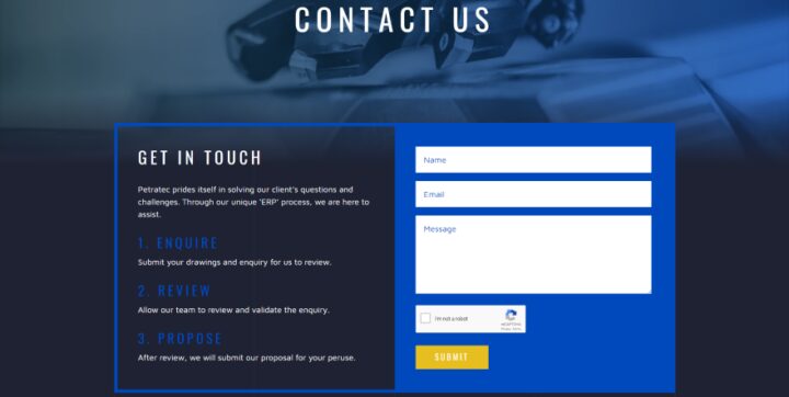
Last but not least, a common mistake is not clearly showing users the website’s contact information. This happens actually quite often and it is easy to avoid. Today’s buyers are not patient. The longer they are searching for information, the higher is the possibility they will lose interest and go elsewhere.
They don’t want to spend their precious time finding out how to contact you (instead, they will just go to another website and never come back again), so make sure your contact info is easy to find.
In conclusion, web design is an industry that has started to grow exponentially, and it is expected to grow even more in the next 5 years.
There are many career opportunities for web designers, and they can make a good living in this profession. Of course, in the beginning, mistakes will happen, but they are also part of improvement. Just practice more and more! Practice makes perfect when it comes to web design.
