Pop-ups for Ecommerce, Best Practices
Despite any superstitions towards pop-ups nowadays, people are more than willing to deal with them. The question is how to use pop-ups on a website effectively?
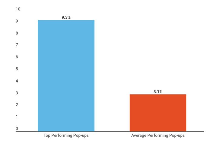
Different statistics examined the conversion rate after implementing pop-ups and clearly illustrate the uprise in revenue. For example, the SumoMe survey demonstrates the rise in conversion after implementing pop-ups.
If your goal is to get the most from your eCommerce website, keep reading to find out some high-yielding tactics. Also, check out here for more information on the topic.
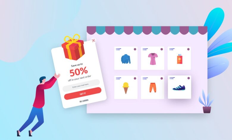
What are the Pop-ups?
So what are the pop-ups anyway? Pop-ups refer to floating boxes that appear on a website while triggered. Normally, they disable the main page and require interaction from a user. Some may argue that pop-ups spoil user experience and indeed they can if implemented without prior thought. But how to make them just right?
Best Practices for Using Pop-ups
Below are five points to keep in mind while creating pop-ups for a website.
1. Consider the design of your pop-ups
It’s needless to say that the design of your pop-ups should ideally be catching and hard-to-miss. A great design with visuals can instantly grab customers’ attention and bring them closer to clinching the deal.
But also bear in mind that it’s always better to stay minimalistic and not to overburden your pop-ups with unnecessary details, that could distract or prevent your prospects from getting the message of an offer. While tailoring a pop-up, consider integrating something from your brand’s identity, like a logo or prevailing colors. Such small details will help your smart widgets fit in the canvas of a website more organically.
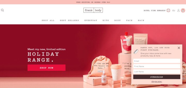
Using a pretty simple but enticing design, Frank Body offers 10% of the first purchase for new visitors in exchange for their data. The font in the pop-up is the same as on the packages shown in the background. Moreover, the pop-up, exactly as the website itself, is pink, which looks non-intrusive, but complementary.
2. Make it feel more like an offer and less like an ad
When it comes to increasing sales with pop-ups, it’s essential to create a great customer experience first. Some may feel hesitant about pop-ups in general unless they offer value and do that in a personalized way.
Instead of displaying a pop-up to sell, think about asking your customers a question to get to know your audience better. It will help you to show or update them with more relevant information that they will be likely to find of use for themselves.
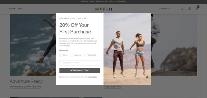
For example, Vuiori shows a pop-up with a discount for new customers, asking them about their clothing preference at the same time. Such an approach encourages your leads to spend more time on a website interacting with a brand. Personalized offers are more apt for building the right connection and winning loyal customers.
3. Leverage FOMO
FOMO stands for “fear of missing out”. In a nutshell, it’s a desire to be involved and connected to a certain event or situation, rather than being left out of the boat. This psychological trigger is inherent for humans in many spheres. It works as well in digital marketing.
As a business retailer, you can use FOMO in different formats when it comes to pop-ups. These can be time-limited offers, a countdown, a free next-day delivery deadline, and many more.
Creating a sense of urgency while providing a customer with a discount coupon increases the chances that they will use it. Knowing that it’s only valid for, say, 24 hours, means that prospects will be more likely to remember about it.
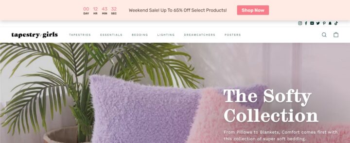
Tapestry Girls website displays a unique weekend sales offer with a countdown. Receiving such an offer is somewhat tempting to continue browsing on a website and add a couple of items to the cart.
4. Create tap-friendly pop-ups
Pop-ups were always seen as a rather controversial tool, as some people had a negative experience with them. It’s highly annoying when you land on a webpage and instead of preceding to look for necessary or desirable information, you are preoccupied with closing numerous floating boxes.
That’s why while tailoring pop-ups for a website, make them as more user-friendly as possible. It’s always better to give customers a choice. If they are not interested in the offer, it must be possible to close the pop-up. And here comes another peculiarity to consider.
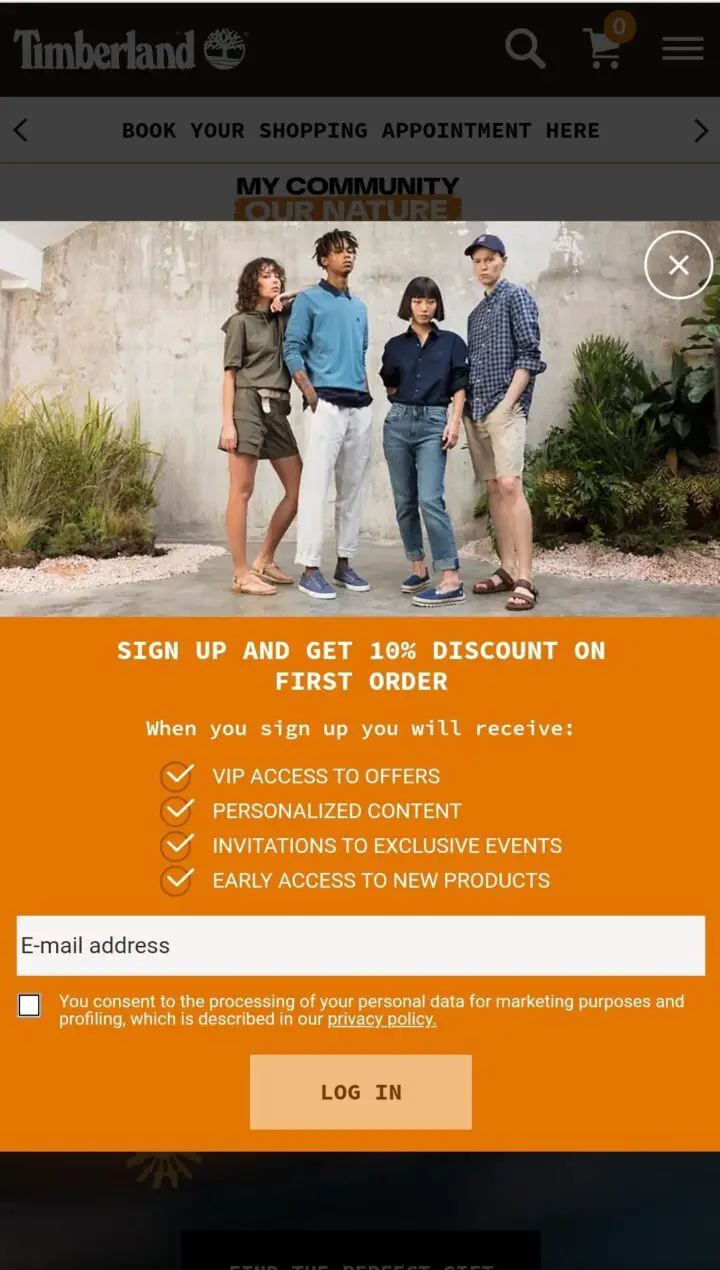
OuterBox noted that more than half of internet shopping is done from mobile devices. Bearing this information in mind, any website needs to be primed both for laptops and mobiles. This also concerns smart widgets respectively. If you run pop-ups for a website, make sure they are easy to deal with from different devices.
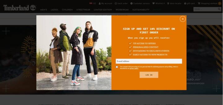
Have a look at how Timberland created a pop-up for their website. At the right corner, a user can see an exit button. So it’s possible to close an offer straight away if a user isn’t interested.
Here is how the same pop-up looks on a mobile. Although the design is almost the same, it’s as easy to close a box as from a laptop.
5. Keep testing them
Pop-ups are those tools that can’t be created once and forever. They require a lot of testing to suit customers’ needs as best as possible and produce desired results for your business.
A/B test your smart widgets to find out which CTA or visuals perform better. It’s not necessary to settle on one version. You can try out versatile formats and change them anytime based on your visitors’ reactions and interaction.
For that, it would be helpful to choose a service that will enable you to get the best version of your widgets.
Wrapping Up
When it comes to creating and implementing smart widgets for business, there can numerous things to manage. Optimizing pop-ups for a better user experience is essential. The five practices listed above can hopefully guide you towards a greater number of customers and higher revenue.