Website Responsiveness Best Practices

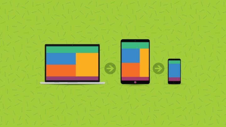
If one were to put a simple definition to “responsive web design” it would state that it is the methodology of developing websites that adapt in their display depending on where they are being visited from. Mobile responsiveness is the idea of making a website render when accessed from a mobile device instead of a traditional browser. That means that the display of the page will respond accordingly regardless of the type of device is accessing it.
Responsive web design makes things easier for the website owner, who, instead of needing to develop separate sites for mobile and traditional browsers, can have one central place that satisfies the requirements of any accessing device. Designing a responsive website is no easy task. The designer must ensure that it is mobile-friendly for display and in terms of logical, intuitive, and high-performing functionality.
To ensure maximal performance, web designers have several great tools at their disposal that permit the creation and testing of optimal websites. For the sake of this article, let’s hone in on some best practices that web designers should follow to create a website that is both fully functional and aesthetically appealing at the same time.
Use Of Web Topography

Because web topography lies at the foundation of all web design principles, it is crucial to understand the guidelines by which it operates. Alongside having extensive design knowledge, web developers must also understand web typography in extensive, technical detail, allowing them to create optimally responsive websites.
Image Prioritization
Images cast a psychological connection with anyone who views them and are essential in understanding effective web design. As the saying goes: “a picture is worth a thousand words.” The adage holds especially true in web design; we’re seeing an image that can transport a visitor into thinking about other items they might be interested in purchasing. Therefore, the presence of images is paramount, but their prioritization is also crucial.
Every image should be developed into a particular format to use images most effectively. For instance, photos render best in JPG format, while symbols, logo designs, and banners look best in PNG-8 form. Tools such as TinyJPG allow for another essential image-related aspect to be addressed: resizing. Larger images slow download times of the site (awful for SEO), so resizing them to smaller files without sacrificing quality is a great way to keep the image’s resolution crisp while reducing the size of the file for the site to have to load.
Correct Use Of Media Queries
Once most web browsers began supporting “media inquiries” in 2012, developers began plotting them out in their CSS initial proposals for designs. When web developers find ways to utilize them effectively, website displays can be assimilated to render various-sized images. When a new idea or gadget is utilized, media queries seek out the pertinent parameters, including resolution and alignment, to resize them to proper form. When images are smaller in size, they take less time to load. If the image quality is not sacrificed in rendering an image, websites can maintain a great appearance while displaying images based on the accessing device.
Grid Layout Building
Because device screens differ, not every website can be grid-mapped similarly. Therefore, a responsive website needs to dynamically adjust the grid layout based on the device browser from which the website is being accessed. Screen size, therefore, can dictate, for instance, whether the “My Menu” bar appears as a small sidebar by the banner, as a horizontal intermediate menu, as a full sidebar, or as a bottom menu, something that cannot be achieved with a class-based grid model. A CSS grid layout can generate an intuitive and crisp-looking code optimized for maximum responsiveness.
Buttons Made To Fit The Accessing Screen
Many web developers incorrectly assume that a responsive screen of a smaller size requires smaller buttons, believing that they are more easily accessible on a smaller screen. However, all those smaller buttons usually tend to frustrate users who try to click them from already smaller displays. If the size can only be adapted so much, then the buttons’ maneuverability is most important in responsive design. That means that not only should developers use a technique of cushioning (or padding) which leaves generous space around the buttons allowing them to be clicked even if the user taps their very outer edges, but also pay attention to the colors the buttons appear in for the user’s to see where the button’s parameters are.
Form Field Input Elements
Many websites have forms, another aspect of design that needs to be adaptable to the widths and sizes of different screens, but making the fields themselves displayable is not sufficient. When a user taps an input field to type inside it, a keyboard must display to allow them to do so, and this keyboard must be of the correct type. In other words, if a user will need to type something in, then a textual keyboard must be displayed. If, on the other hand, the field requires a numerical value, a keypad offering only numerical choices should display when the field is navigated to. In doing so, the developer is helping the user enter the necessary field values faster and easier, creating a better UX experience.
Smooth Navigation

The importance of smooth navigation cannot be overstated. The lack of it is one of the main reasons users abandon exploring a website altogether. To be considered “smooth,” the navigation must permit users to access every page on the site. While a standard browser version of a website has links to other pages visible, mobile versions of sites often utilize the “the hamburger” icon, which, when tapped, reveal the links hidden beneath them. However, a web designer should not assume that this is intuitive navigation for all users. Some users will be frustrated by the need for extra action, and some will not know that they need to take it. Not finding what they need will result in them leaving the site.
This problem can usually be avoided by never hiding the essential links behind icons. The important menu-bar links should be left in visible form rather than expecting a click to make things expand or collapse. The rest of the links (non-essential) can still be stored in the ‘hamburger’ menu.
Separate Buttons From Content
“Share” buttons are an essential and powerful tool to use on sites. By clicking these, visitors can share content with others who will visit the site, increasing traffic. One standard design error is that some designers allow the Share button to block portions of the content, especially on smaller screen displays. For that reason, it is essential to verify that the Share button is distinguished from the rest of the content. On those displays under 768 pixels, developers may consider disabling the button altogether.
“Less Is More” – Stick To Minimalistic Design
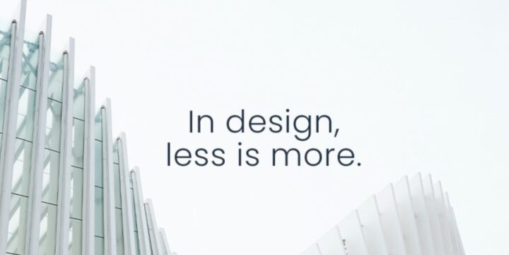
Great practice web designers and developers focus on using is the application of minimalistic design practices. This clears up a website’s content by decluttering the rest of the space, drawing the user’s attention only to the necessary features of the site. This improves UX and places that sell products and directs more attention to the products sold, resulting in higher conversion rates.
The biggest draw of minimalistic design, of course, is its ability to highlight the critical aspects of the site to visitors, such as ‘Call To Action’ buttons or marketed products. From a responsiveness perspective, minimalistic design requires less loading time and makes the visibility of the site clearer, a vital factor in both standard and mobile site designs. Click here to see agencies that create such designs.
The Takeaway
Mobile devices are used more than ever to access websites. That trend is only going to grow, and you’re going to need to be prepared. The best responsive web design practices keep users and search engines in mind. That’s how you’ll be able to create a website that ranks well and keeps users engaged.